LUUK
Personalizing the luukshopping experience
💡 How we turn a generic process into an agile, intuitive and personalized experience by directly connecting users with dedicated luukshoppers.
.jpg)
The Context
At Luuk, we had a clear mission: to give Salvadorans back their time by eliminating the need to shop in person. We wanted to create a digital experience so personalized that users felt as if they were there. One of our biggest differentiators were the luukshoppers, people dedicated to making purchases for users, personalizing them through direct communication that guaranteed speed and satisfaction.
However, this personalization, which started with the luukshoppers, had the potential to integrate even more deeply into the digital purchase flow within the app. We identified several key areas of improvement to make the experience more seamless, efficient and aligned with each user's individual needs.

Our Challenge
Redesign the purchase flow to make it faster and more personalized, strengthening the customer-luukshopper connection and ensuring that each experience was unique.
The Problem
While the luukshopper experience was one of Luuk's biggest differentiators, it was not fully reflected in the digital flow. We identified several key friction points that affected the user experience:

1
Lack of personalization in the digital process
Users had to search for products manually, without receiving suggestions based on their preferences or previous purchases, which increased friction and navigation times.
2
Disconnection between the app and luukshoppers
Although direct communication was a pillar of the experience, it was not integrated from the beginning of the digital process.
3
Abandoned carts
These frictions generated frustration, resulting in higher cart abandonment rates and loss of trust in the platform.

My Role
As a UX Designer, I was in charge of
Identify
Identify friction points in the digital experience and with luukshoppers.
Design
Design a personalization system that would leverage shopping habits and improve search.
Prototype
Prototype and iterate solutions that integrate human attention with more efficient flows.
The result was a more agile and connected experience, highlighting Luuk's unique value.
Benchmarking
To address these problems, we analyzed how leading personalization platforms, such as CornerShop, Instacart and Rappi, solved similar flows. We drew inspiration from:

Recommendation systems
Display products based on times of the day, user preferences, promotions that may be of interest and proximity to stores
Optimized search flows
Integrate dynamic suggestions and local trends to shorten search times.
Connected experiences
Highlight human interactions at every step of the process to build trust and loyalty.
These benchmarks guided our strategic decisions, adapting them to Luuk's local context and the needs of our users.
Problems Detected
The key screens of the original flow are shown right, highlighting critical points for improvement:
-
Nowhere are there any personalized offers or recommendations
-
No clear hierarchy of which categories are most important to the user
-
The search bar as well as the search button serve two different purposes instead of being a unified feature.
.png)
.png)
.png)
Design Process
How we transform insights into personalized solutions to optimize the shopping experience in Luuk
Key Insights
"The beginning of the journey mattered more than we thought."
The purchase flow started with a generic experience, without guiding the user to relevant products from the homepage.
Personalization should start from the first contact with the app, not only within the purchase process.
"The way users searched for products was not efficient."
Some users were exploring products without a clear objective, while others already knew what they wanted to buy but took too long to find it.
"The value of the luukshopper was to be felt from the start."
The human experience was one of Luuk's key differentiators, but it was not well reflected in the UI.
If the user had a seamless experience from purchase to delivery, they were more likely to use Luuk again. We had to reinforce the delivery through a more unified flow for luukshopper communication.

We revolutionize your shopping: from your favorites to what you didn't know you wanted, all in one place. With LUUK, the future of shopping is in your pocket.
Exploration and Flow Redefinition
With these insights in mind, we explored different purchase flow structures, testing how small changes in the journey could improve the experience.
One of the most significant changes was the redesign of the homepage.
In analyzing the options, we concluded that rather than just improving search within the purchase flow, we should start by offering a more personalized experience from the home screen.
Proposals explored
-
A homepage with quick access to the features that users access most often and that are most important to them.
-
"Quick Buy” sections for recurring users.
-
A more personalized access to favorites, promotions of the day according to tastes and categories in general.
-
For this it was crucial to start from scratch and explore the information architecture and what kind of design we were going to implement, so that it was not only customized, but fluid and didn't feel cluttered.


Our Solution
After multiple iterations, we refined the design so that each user felt that the app understood exactly what they needed from the start.
Key Final Design Improvements
Personalized Homepage
Goal: Make each user find the stores they consider relevant from the first contact with the app, making the whole experience easy, customizable and human.
Shortcuts
To understand which elements are important and to give clear information to the user.
Favorites and Highlights
Clear visualization of your favorites and the stores highlighted within your behavior
Promotions
Promotions that go hand in hand with user tastes and needs
BEFORE


AFTER


Key Final Design Improvements
Store Pages
Goal: Create a store page that is understandable to the user, with relevant information and dynamic elements that invite exploration.
Hierarchy
To understand which elements are important and to give clear information to the user.
Immediacy and ease
In the sections of the page and the way to navigate in them with a horizontal scroll and “see all” buttons.
Offers within reach
Promotions that go hand in hand with user tastes and needs
BEFORE


AFTER


Key Final Design Improvements
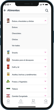
Subcategories
Goal: Optimize the taps that the user takes to reach the products within the categories.
Information Architecture
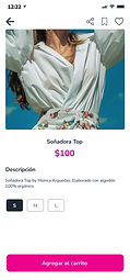
We changed the design of both categories and product pages, so that the user always knows where he is and can better interact with the flow.
Uniformity
We ensured that all product cards follow the same standard across platforms and different rooms of the app.
Minimalism
We eliminated all the elements that did not contribute, so that the user would have a much clearer flow.
BEFORE


AFTER

Key Final Design Improvements
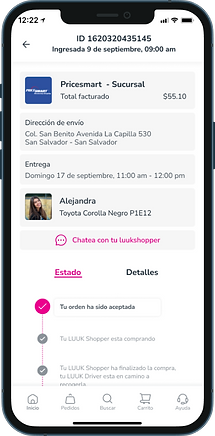
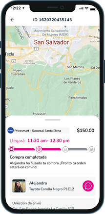
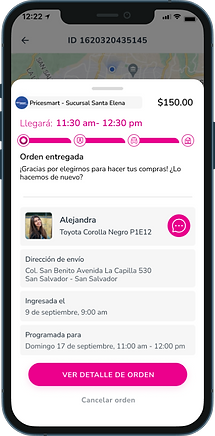
Purchase Tracking: Eliminating Uncertainty and Enhancing Security
Reducing uncertainty with real-time tracking and integrating shopper communication for a seamless experience.
Real-time visual
tracking
Featuring an interactive map and detailed order status updates.
In-app chat with the luukshopper
Eliminating the need for external apps and keeping everything within the Luuk ecosystem.
Personalized Push Notifications
Informing users about each stage of the process without requiring them to check manually.
BEFORE

AFTER
Our Results
This redesign not only optimized the shopping experience, but also strengthened user loyalty and trust in Luuk.
Impact & Results
This redesign not only improved the shopping experience but also strengthened user retention and trust in Luuk.
5.0 CSAT
Customer Satisfaction Score (CSAT) of 5.0
Users rated the post-purchase experience as more reliable and seamless.
15-20%
Projected 15-20% increase in customer retention and sales per user
The personalization of homepage, stores, categories and purchase tracking encouraged repeat purchases and higher spending per customer.
25-30%
Estimated 25-30% reduction in purchase-related inquiries and complaints
The real-time tracking system significantly lowered user uncertainty, reducing the number of "Where is my order?" inquiries.
20%
Stronger connection between customers and luukshoppers, leading to 20% higher engagement with in-app chat
The direct shopper-to-user chat feature improved response time, giving users a greater sense of security and a more immersive experience.
Final Conclusion
This redesign transformed a generic shopping flow into a fully personalized experience from start to finish, ensuring that users could find what they needed faster, make informed decisions, and trust the service beyond checkout.
.png)


.png)
.png)

.png)
%2016_11%201.png)